
Go back
Chaos to Clarity Campaign
For our go-to-market day, we lunched a campaign called "Chaos to Clarity".
I designed several minimalistic banners and posters and a presentation for the campaign. I'll share a few examples.
Krudo Industrial
While working with KRUDO Industrial, I was tasked with designing everything required for marketing and the turning of the gears of the company. These included brochures for machinery, social media posts and presentations.
While it's a fun and challenging experience, working in the serious world of industry, one gets few chances to unleash the creative flow. The first rule is to stay in the familiar realm of the audience.
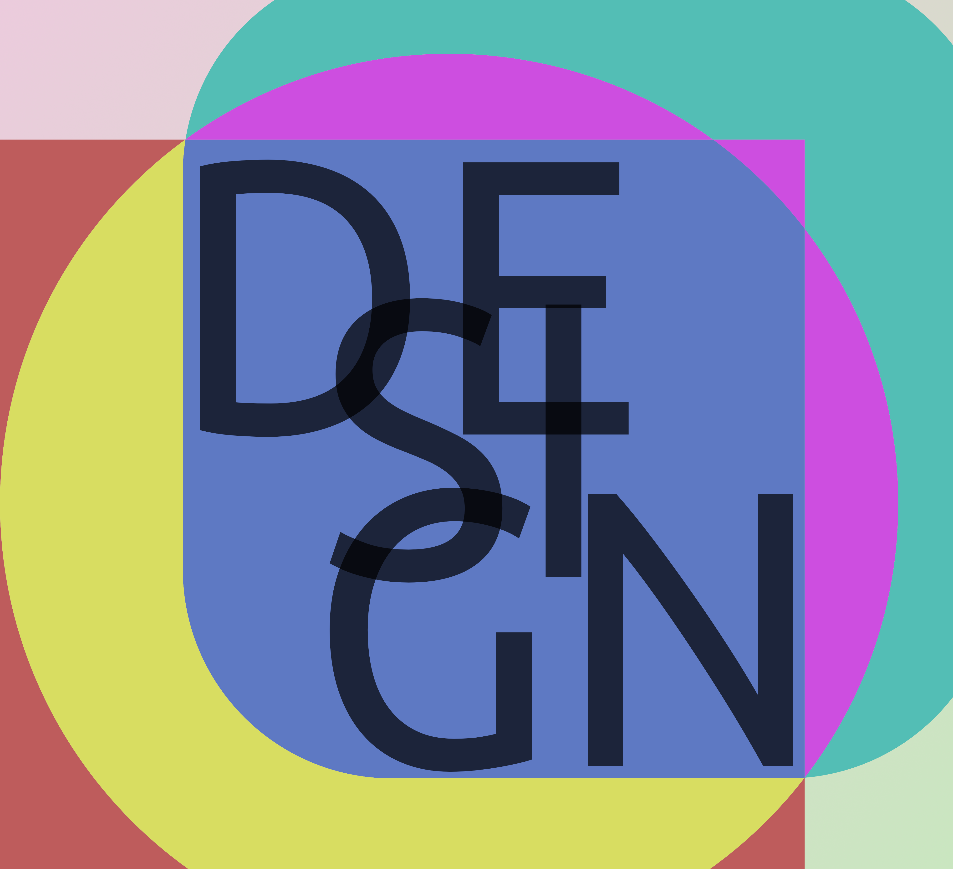
Logos
The following are some other examples of my work in the field of logo design. Enjoy...
Brand Identity - new roots
Primary Logo
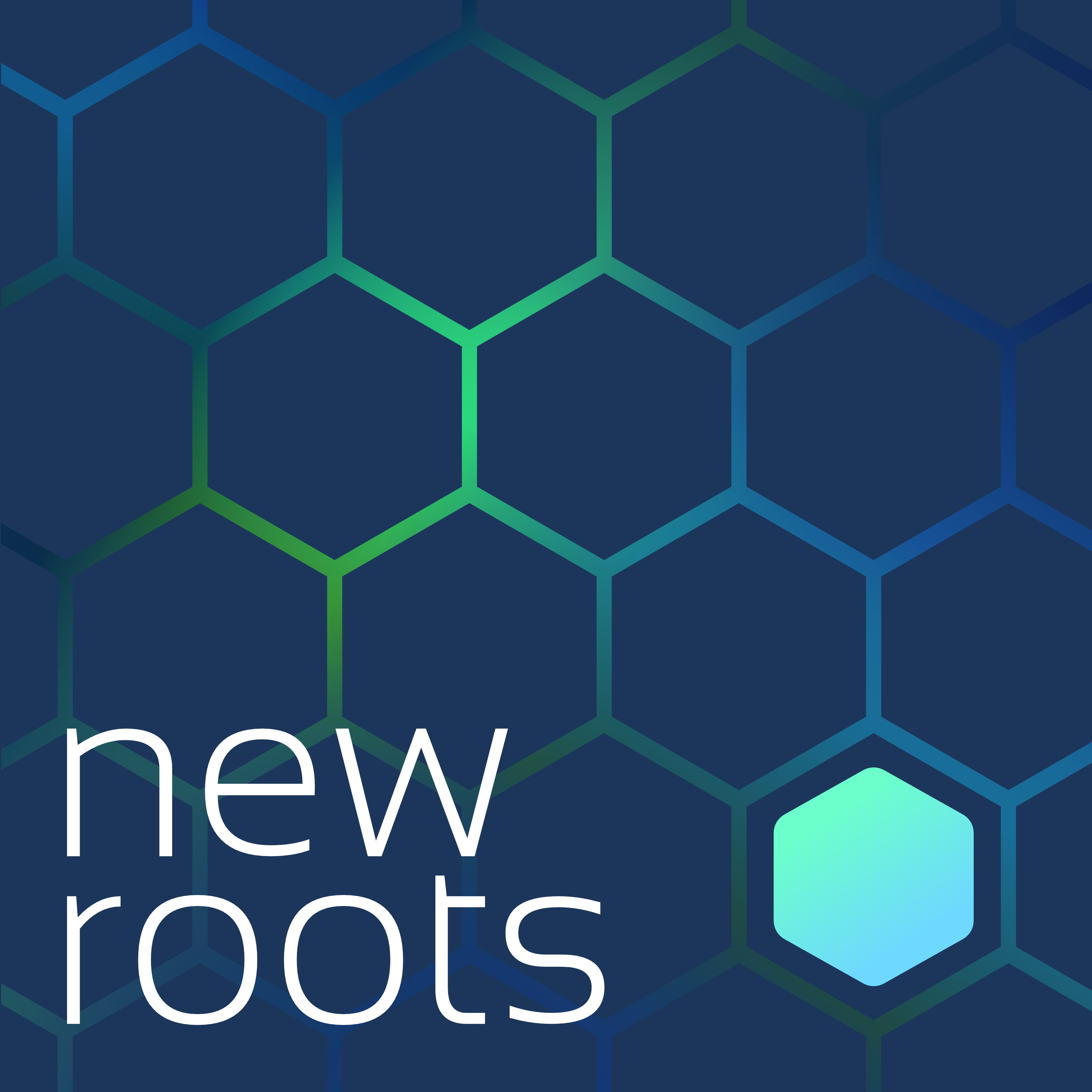
Icon

new roots
Solid

new roots
Shape
The logo is based on a rounded hexagon, chosen for both structural and emotional reasons.
- Geometry: The hexagon represents a strong and balanced structure where all elements fit together naturally.
- Psychology: It conveys a sense of community, connection, and companionship.
- Design choice: Rounded corners combined with a soft gradient make the shape more approachable, friendly, and modern.
- Conceptual contrast: The smooth hexagon contrasted with the sharp grid subtly represents a “stranger” trying to find their place.
Why the Hexagon?
YOU are the hexagon.
Even if you feel different, you belong here.
You will fit perfectly — we’ll make sure of that.
Color
Background:
Dark, slightly desaturated blue - Symbolizing
trust - confidence - stability - calmness.
Primary Color — Navy Blue
#1B365A
- Represents trust, stability, and intelligent structure
- Acts as the foundation of the visual identity
Usage:
Logo, headers, buttons, links, key brand elements, and dark text.
Secondary Color — White
#FFFFFF
- Represents openness, warmth, and clarity
- Creates breathing space and emotional calm
Usage:
Backgrounds, large surfaces, and elements on dark areas.
Accent Color
Blue–Green Gradient
#6ED8FF → #6CFFCC
- Represents energy, humanity, and hope
- Adds life and emphasis without overpowering the system
Usage:
Call-to-action elements, highlights, key interactions.
Neutral Colors
Used to support readability, spacing, and visual balance across the interface.
Ingenious Engineering
After designing their logo and a simple brand identity, they hired me again to design their booth at an international exhibition. I created the designs and presented them in a simple 3D model of what the booth will look like. Each image might not be impressive on its own, but they get together and serve their purpose as a whole.
... and more
The following are some other examples of my work in the field of graphic design. Enjoy...

Farzad Shafai
visual design
Go back
Chaos to Clarity Campaign
For our go-to-market day, we lunched a campaign called "Chaos to Clarity".
I designed several minimalistic banners and posters and a presentation for the campaign. I'll share a few examples.
Krudo Industrial
While working with KRUDO Industrial, I was tasked with designing everything required for marketing and the turning of the gears of the company. These included brochures for machinery, social media posts and presentations.
While it's a fun and challenging experience, working in the serious world of industry, one gets few chances to unleash the creative flow. The first rule is to stay in the familiar realm of the audience.
Logos
The following are some other examples of my work in the field of logo design. Enjoy...
Brand Identity - new roots
Primary Logo
Icon

new roots
Solid

new roots
Shape
The logo is based on a rounded hexagon, chosen for both structural and emotional reasons.
- Geometry: The hexagon represents a strong and balanced structure where all elements fit together naturally.
- Psychology: It conveys a sense of community, connection, and companionship.
- Design choice: Rounded corners combined with a soft gradient make the shape more approachable, friendly, and modern.
- Conceptual contrast: The smooth hexagon contrasted with the sharp grid subtly represents a “stranger” trying to find their place.
Why the Hexagon?
YOU are the hexagon.
Even if you feel different, you belong here.
You will fit perfectly — we’ll make sure of that.
Color
Background:
Dark, slightly desaturated blue - Symbolizing
trust - confidence - stability - calmness.
Primary Color — Navy Blue
#1B365A
- Represents trust, stability, and intelligent structure
- Acts as the foundation of the visual identity
Usage:
Logo, headers, buttons, links, key brand elements, and dark text.
Secondary Color — White
#FFFFFF
- Represents openness, warmth, and clarity
- Creates breathing space and emotional calm
Usage:
Backgrounds, large surfaces, and elements on dark areas.
Accent Color
Blue–Green Gradient
#6ED8FF → #6CFFCC
- Represents energy, humanity, and hope
- Adds life and emphasis without overpowering the system
Usage:
Call-to-action elements, highlights, key interactions.
Neutral Colors
Used to support readability, spacing, and visual balance across the interface.
Ingenious Engineering
After designing their logo and a simple brand identity, they hired me again to design their booth at an international exhibition. I created the designs and presented them in a simple 3D model of what the booth will look like. Each image might not be impressive on its own, but they get together and serve their purpose as a whole.
... and more
The following are some other examples of my work in the field of graphic design. Enjoy...
Farzad Shafai
visual design
Go back
Chaos to Clarity Campaign
For our go-to-market day, we lunched a campaign called "Chaos to Clarity".
I designed several minimalistic banners and posters and a presentation for the campaign. I'll share a few examples.
Krudo Industrial
While working with KRUDO Industrial, I was tasked with designing everything required for marketing and the turning of the gears of the company. These included brochures for machinery, social media posts and presentations.
While it's a fun and challenging experience, working in the serious world of industry, one gets few chances to unleash the creative flow. The first rule is to stay in the familiar realm of the audience.
Logos
The following are some other examples of my work in the field of logo design. Enjoy...
Brand Identity - new roots
Primary Logo
Icon
new roots
Solid
new roots
Shape
The logo is based on a rounded hexagon, chosen for both structural and emotional reasons.
- Geometry: The hexagon represents a strong and balanced structure where all elements fit together naturally.
- Psychology: It conveys a sense of community, connection, and companionship.
- Design choice: Rounded corners combined with a soft gradient make the shape more approachable, friendly, and modern.
- Conceptual contrast: The smooth hexagon contrasted with the sharp grid subtly represents a “stranger” trying to find their place.
Why the Hexagon?
YOU are the hexagon.
Even if you feel different, you belong here.
You will fit perfectly — we’ll make sure of that.
Color
Background:
Dark, slightly desaturated blue - Symbolizing
trust - confidence - stability - calmness.
Primary Color — Navy Blue
#1B365A
- Represents trust, stability, and intelligent structure
- Acts as the foundation of the visual identity
Usage:
Logo, headers, buttons, links, key brand elements, and dark text.
Secondary Color — White
#FFFFFF
- Represents openness, warmth, and clarity
- Creates breathing space and emotional calm
Usage:
Backgrounds, large surfaces, and elements on dark areas.
Accent Color
Blue–Green Gradient
#6ED8FF → #6CFFCC
- Represents energy, humanity, and hope
- Adds life and emphasis without overpowering the system
Usage:
Call-to-action elements, highlights, key interactions.
Neutral Colors
Used to support readability, spacing, and visual balance across the interface.
Ingenious Engineering
After designing their logo and a simple brand identity, they hired me again to design their booth at an international exhibition. I created the designs and presented them in a simple 3D model of what the booth will look like. Each image might not be impressive on its own, but they get together and serve their purpose as a whole.
... and more
The following are some other examples of my work in the field of graphic design. Enjoy...
Farzad Shafai
visual design