UI Design
"reloTrack is designed to streamline the intricate process of machinery relocation. From disassembly to reassembly, this platform ensures that every component is meticulously tracked and managed. The use of advanced QR code technology in reloTrack not only simplifies tracking but also enhances the overall efficiency and accuracy of the relocation process."
I joined the team the UI/UX designer a few months after they started. The product had no design and was nothing but black text on white background. I started the design overhaul with the webApp, and then moving on to the android and iOS app and an intricate landing page.
Over time, I started developing a design system on the side which I gradually applied to the design and development.
____________________
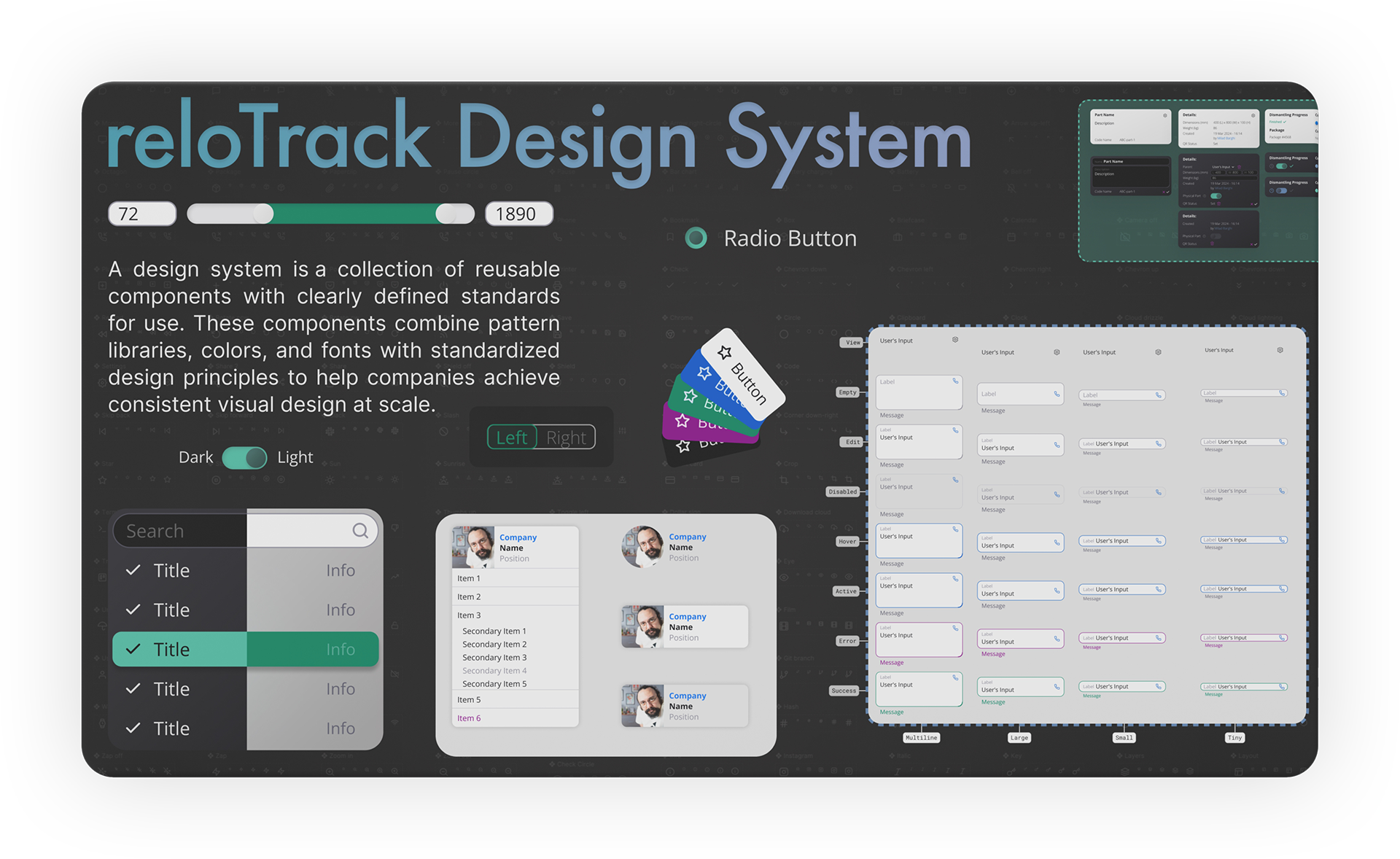
reloTrack Design System
I started the design overhaul with going through the existing product and recreating every page and function. After that, I mapped the exiting user experience and recreated new, optimized user journeys. Then got started with the UI design.
Since I joined late, other aspects of the product were ready and everyone was waiting for my input. Even though speed was crucial, future proofing and maintainability were one of my main concerns. To achieve that, I started with creating Figma components for major elements, such as header, footer and some of the cards.
After delivering the first stage of the design, while our developers were working on the code, I paid attention to their pain points during the process. I know what I was going to do. I just wanted to know where to start.
I started with colors. I crated a visual table showing all the colors, their hex codes, and where they were used. While that instantly made the life of the developers easier, I got started on creating variables for color primitives, colors, typography and so on.
After that was done and tested, I continued working on my small design system and building it from the ground up. Over the span of 4 months, as a side project, I developed every aspect of the design system until it was ready to be incorporated into the current design.
Since the product was still evolving and new features were being added every day, we made a plan to apply the design system gradually, with every new elements that I design or any old ones that we change. With this plan we didn't need to pause the progress and we could continue to grow and improve at the same time.
____________________
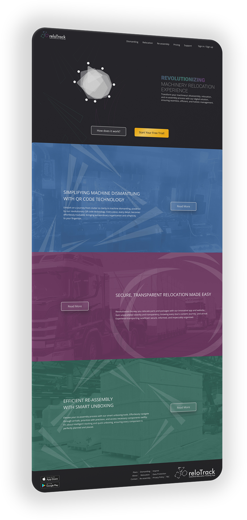
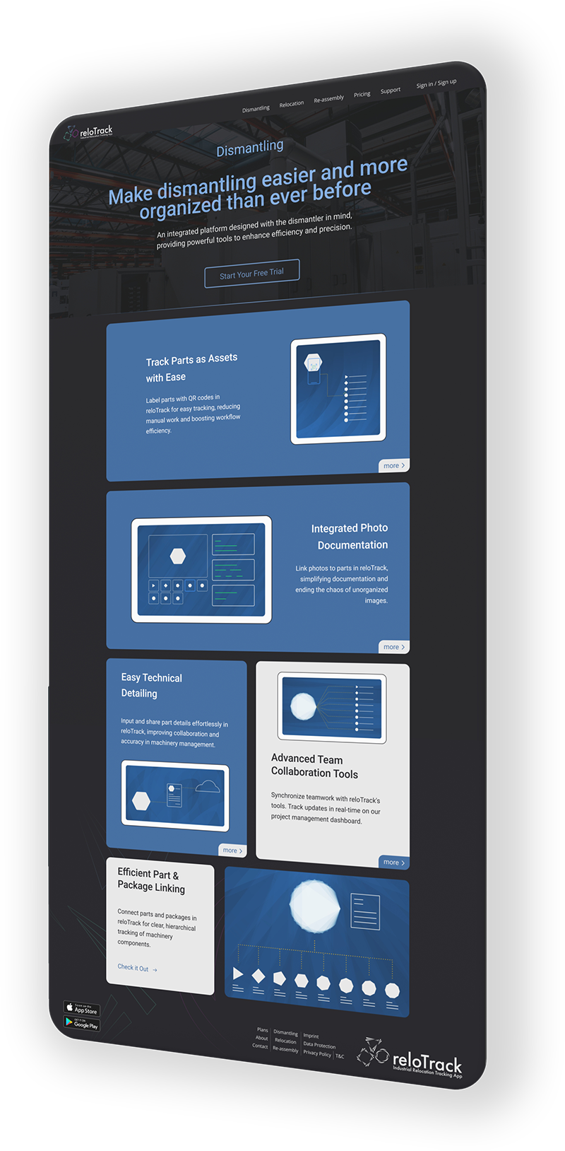
reloTrack Website
Don't hesitate to visit the landing page. It looks great!
Along with everything else, I also created the hero animation from scratch. It was a very long process, through which, I learned a lot
I set out to learn how to create a 2D animation in Adobe After Effects, compatible with json, and export it to create long, yet super light, animation for the web.
There are various options online for this purpose with the growing need for SVG animation. But I strive to find and use the best option, rather than the easy one. Specially when you have to pay more for less creative freedom.
____________________
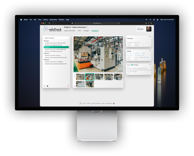
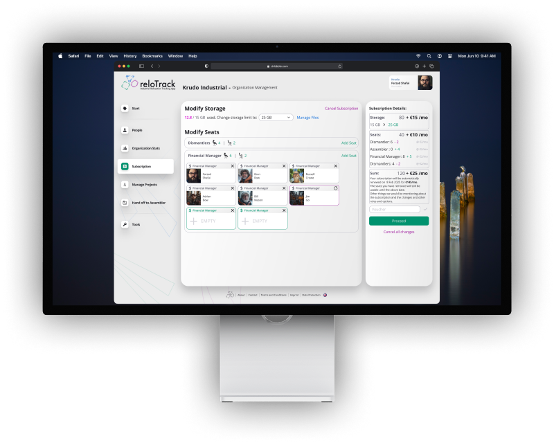
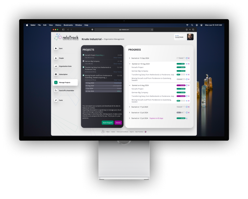
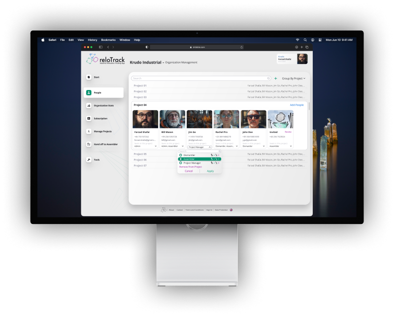
reloTrack Web App
The web app is the administrative panel, used mainly to oversee all the projects in an organization and manage subscription, files, projects and people.
The main goal in the design of the web app was to present everything at a glance!
The biggest challenge was, and still is, to avoid scrolling on the page. This decision was made based on the result of UX research and surveys among the people in the industry.
The stakeholders need to feel solid ground under their feet. When the progress of your million Euro project is unfolding in front of your eyes, you don't want one hand on the mouse and keep scrolling up and down, trying to figure out what is where.
To limit the need for scrolling, I incorporated a card-based design that understands what the user needs to see and shows the related cards. Each card is collapsable, sometimes scrollable and most importantly, editable.
The amount of information that is being shown on the screen can sometimes be overwhelming. This is the nature of the product and what it does, and there is no way to avoid that. What I could do to help minimize the overwhelming effect, was to enforce stability into the design, making sure the user is not redirected to different screens for the smallest tasks. The editable cards and expandable panes make sure the users always know where they are and how to go back.
____________________
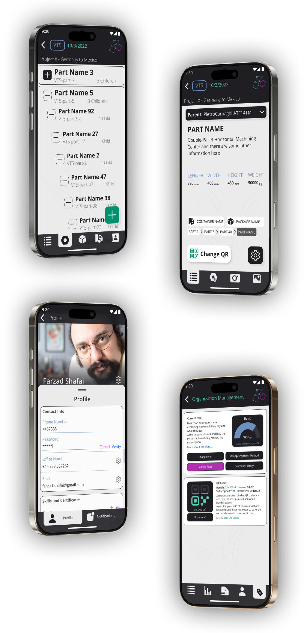
reloTrack Mobile App
The mobile app, mainly belongs to the foot soldiers.
They are inside the factory, with their vests and gloves on, and they are making a difference every time they reach in their pockets and take out their phones. And my job is to make it as easy as possible for them!
While I was creating personas for the users of the mobile app, the list of their needs created a delightful challenge that makes this app very unique.
The mobile app users spend their day in a factory that is being torn down. Dark, dirty, rough, dangerous, most of the outlets don't work, and everyone is wearing protective gloves!
This answers our first question: Android or iOS? We went with android because we [correctly] concluded that most workers use cheap android phones in the factory, because they don't want their flagship phones to get dirty or break.
Working in a dark factory meant a Dark Mode was essential for our app. Not only does it prevent momentary blindness every time they take out their phones, it also saves a little bit of battery, if their phones have OLED screens.
What the users do on the app covers less than 5% of their job. All they have to do is to take out the phone, scan the QR code, input a few details and put the phone away. I had to make this process as fast and straightforward as possible. Large and dominant buttons at the bottom of the screen, large text, good contrast and an easily accessible navigation bar, are some of the features that will negatively affect the UI design, but are absolute necessities for the user experience.